
5 Most Common Customer Complaints - Issues with UX, On-Site Customer Experiences and Communications
From difficult discount codes and complicated checkout pages, to confusing delivery options and a lack of responsive customer support, many customers can leave a shopping experience feeling dissatisfied.
After hitting over a million responses on our Census app, we thought it was a good time to share some valuable insights into what customers find the most frustrating about their on-site purchasing experiences.
This data has been collated across a wide range of verticals covering fashion, lifestyle, F&B, luxury, fast-fashion, allowing for a balanced analysis of common complaints.
In this blog article, we’ll hone in on five key areas that cause the most friction in a user’s journey to purchase, taking real life examples and providing actionable suggestions and quick wins on how brands can improve the experience and prevent their customers raising the same concerns.
Welcome offers & discount codes
Discount codes, particularly ‘welcome offers’, are created as routine practice with the goal of increasing conversions. The data shows that a large number of brands are failing to validate the end-to-end flow of these discount codes, often overlooking simple details that can be detrimental to brand trust and sales. Some of the most common associated complaints are:
A customer not being able to apply the welcome code at checkout or a customer receiving invalid codes.
- “Been nice to have been offered a code that worked.”
- “Yes the 10% discount was not applied at checkout even though I signed up to your newsletter???”
A brand’s poor communication about a welcome code, such as a code only applicable to orders over a certain threshold, making discount codes difficult to apply, or not communicating properly how they will work.
- “I did not know that my welcome code for 5% off was only for orders over £30 until I was at the checkout stage :(“
- “Could not use discount code on full price item !!!!”
A customer unable to add discounts when using alternative payment methods, such as ApplePay or PayPal.
- “Used ApplePay but there was no where to input my discount code - frustrating”
A brand’s poor timings and triggers of email flows.
- “I am a new customer and although the 10% discount was offered when I subscribed, the code to use was not sent through to me for 4 days.”
- “Not clear how to get 10% discount for subscribing. Got and e-mail but no promo code listed - had to find code elsewhere”.
Key takeaways and quick wins
It is all too easy to ‘set and forget’ a welcome or alternative discount code, especially when using specific apps to auto-generate codes without full testing. Don’t alienate your first-time customers with such an easy one to get right.
Our key suggestions are:
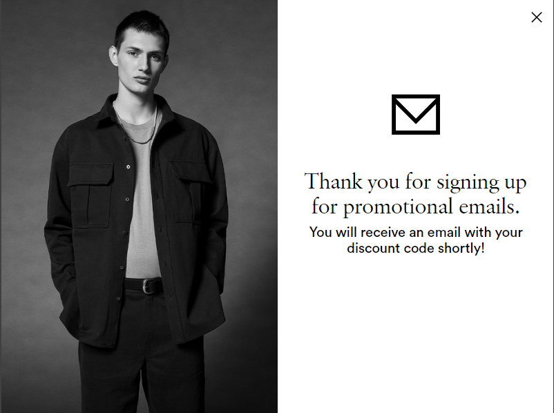
- Add success messaging to your data capture pop-up or footer once the user has subscribed to notify them where and when they will receive their discount code e.g. via email. Tell users to check their junk. Frame Denim example below.
- Check your email flow triggers within your ESP to ensure it is set to fire as soon as a user subscribes to your list. There should be no delay or filters unless the user has already subscribed.
- Confirm that all data capture points (pop-up, embed form in the footer, checkout opt-in etc.) are linked to the correct subscriber lists and flows for a seamless and united journey.
- If a user is already subscribed, trigger an alternative flow telling them they are already a subscriber and to enjoy other benefits like free delivery, new collections, GWP etc. Every ESP will have a different way of handling this, and it may require some custom workarounds. Review this with your account manager.
- If you have a double opt-in process, ensure success messaging on data capture pop-up or form states that customers will be required to confirm their subscription (via email or text) before receiving the code.
- Ensure that users who already subscribed on a particular device do not get shown the pop-up. This works via cookies so it will only apply to a specific browser and device, and needs to be configured within the settings of your form platform.
- Provide detail within the email of exactly where the user should apply their discount code once they get to checkout e.g. right hand panel under order summary.
- For express methods (ApplePay and PayPal) it is essential to notify the user ahead of checkout that the discount code must be applied before selecting an express pay method. This requires mapping out of all messaging touchpoints from mini-bag to checkout.
- Clearly state within your data capture and welcome email if there are any exclusions when utilising the code e.g. cannot be used with sale items or orders over X.
Checkout experience
Shopify’s checkout is globally recognisable and mostly provides reliable and strong performance for brands. However, legacy customisation limitations have occasionally resulted in fractured experiences and increased checkout abandonment. As the last hurdle in the buying process, this was one of the most widely complained about UX areas, so we’ve broken it down into four sub-categories to allow for a comprehensive overview.
Checkout flow
A brand’s complicated checkout flow.
- “The payment process went round in circles five times before it would accept my data and choices.”
A customer’s confusion around which details are being entered for billing and shipping addresses.
A brand’s problems with the website's address validation.
A customer’s issues with contacting customer support during checkout.
A brand’s gift card or voucher code box was tricky to find, particularly on mobile.
Key takeaways and quick wins
Shopify’s new Checkout Extensibility is becoming more widely adopted by merchants as many upgrade from checkout.liquid in order to unlock increased app-based customisation capabilities. The most notable ones that could support in reducing customer complaints around the areas listed above include:
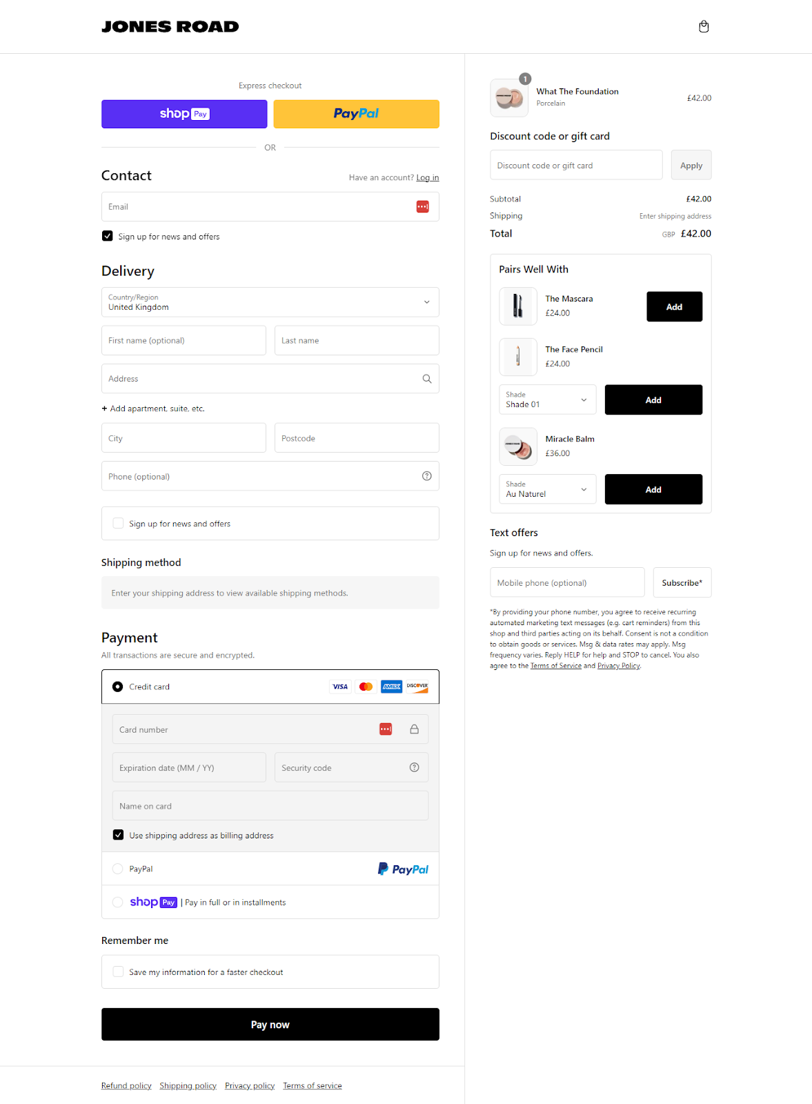
- One-page checkout: Enabling this feature allows for a smoother and faster checkout process with fewer steps to payment and faster transitions through the checkout flow. Many merchants also choose to remove or skip the billing address step with this checkout option, resolving friction in entering and validating both addresses to proceed to payment. Jones Road are good examples of this one-page checkout executed well.
- Address validation: Shopify’s new release provides native functionality for accurate address validation, allowing for suggestions to be generated if users input an unrecognised address.
- Custom logic: Tooltips, custom messaging and logic can now be applied at checkout to highlight shipping restrictions and warnings (e.g. remote shipping zone delivery delays or PO box addresses), making the UX more intuitive.
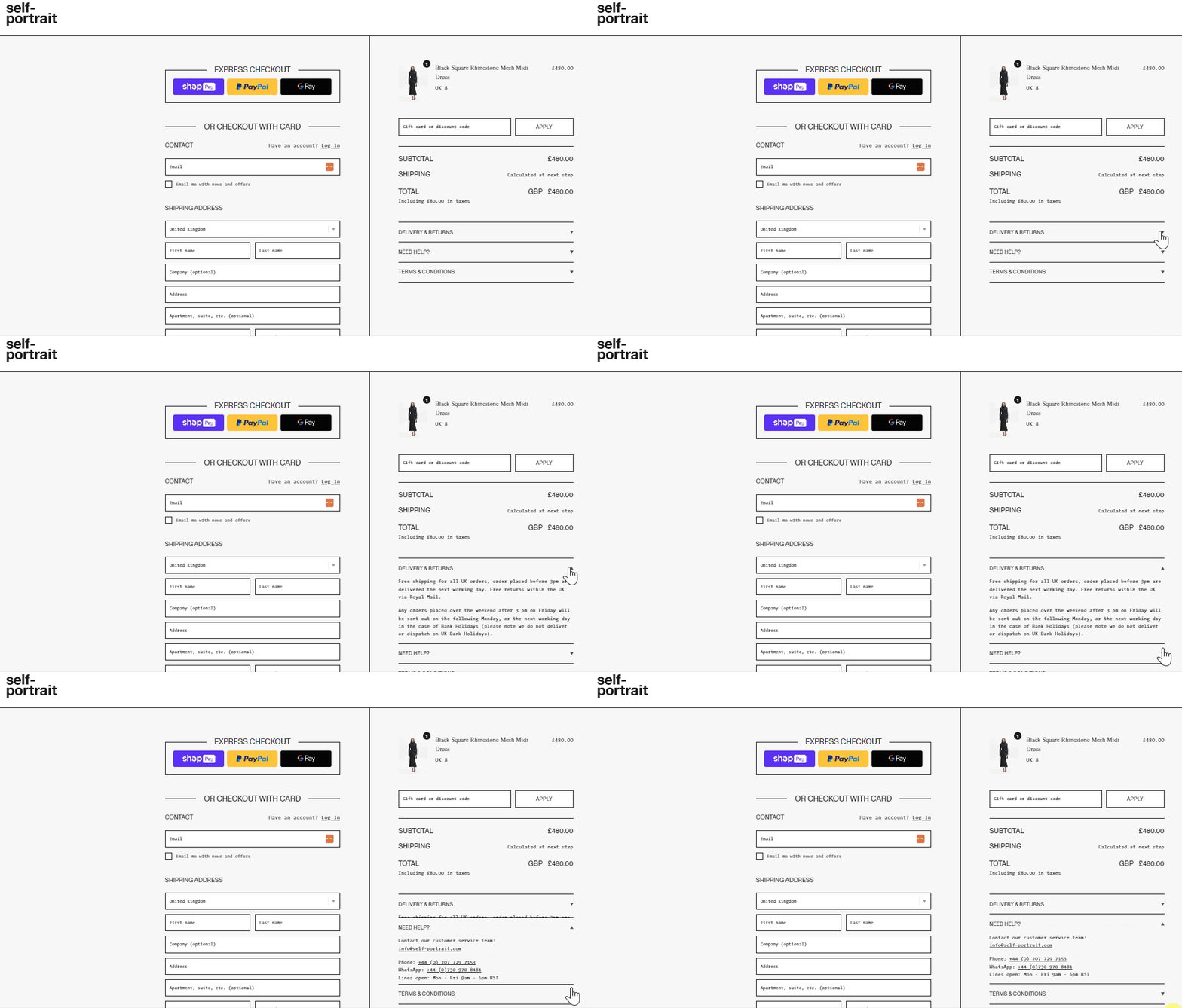
- Ensure that customer support is available at every step of the journey, including checkout to prevent any barriers to purchase. This includes live chat, promoting customer support details and common FAQs on delivery and returns. The key is to assist if users get stuck when making their purchase, without navigating them away from checkout. Examples below from Self Portrait.
- Another one to explore is using a tool such as Status in order to encourage customers to create accounts on their first purchase for faster and more personalised checkout when they return. By utilising the Status app, you can extend the amount of time a login persists from the default 30 to 120 days. It also promotes a frictionless approach to login which is proven to increase the rate of log-in and also sign-up.
Delivery
A customer’s express frustration with expensive delivery fees, unclear delivery timelines, and difficulty changing delivery addresses.
- “The shipping instructions are not clear. I was keen to pay for an express delivery but says it will de delivered in 2 days time??!?”
- “Please show the delivery cost before you are asked to pay”
Key takeaways and quick wins
On average, checkout abandonment rate across Shopify merchants is ~60%, with unexpected delivery costs, duties and taxes being a common reason for this. Users should not be making any new decisions relating to their purchase at the checkout stage.
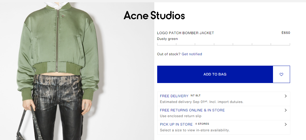
- Communicate delivery times and fees up-front on your PDP, allowing users to make an informed choice ahead of reaching checkout. Brands like Acne studios and The Frankie Shop do this well by using geo-location and postcode lookup to provide an accurate estimated delivery date on PDPs. Apps such as Order Deadline can help achieve this, but alternatively merchants can also just clearly display their delivery options and cut-off times as an additional touchpoint.
Multi-store and international delivery
A customer’s difficulty in entering addresses, or a brand’s miscommunication about which countries the store delivers to.
- “To order from another country to be delivered to a UK address, after trail and error, change the country right at the beginning of the order. It's not immediately clear that it has to happen first”
- “I didn't automatically get redirected to the US site - I was accidentally on the UK site which gave me weird payment options.”
Key takeaways and quick wins
This boils down to how you direct international customers to the correct store that serves their shipping destination and how this is communicated throughout the user journey. Ensure you have:
- Geo-IP pop-up that triggers when a user's IP does not match the store they are on. The overlay should be very similar to Timex (below), with a dropdown to select shipping country and currency. This should proactively be suggested based on a user's IP, whilst still giving them the freedom to change as needed. All selections should be page-level to ensure the user lands on the equivalent product on the new store.
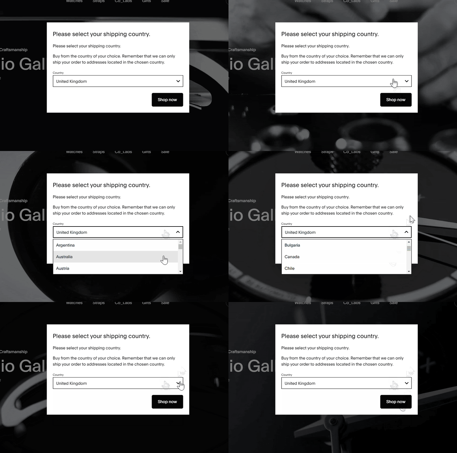
- A country selector to change this choice should remain accessible at all times in the header or footer of the site. This should come with a warning that the user's bag will empty if their selection redirects them to another site.
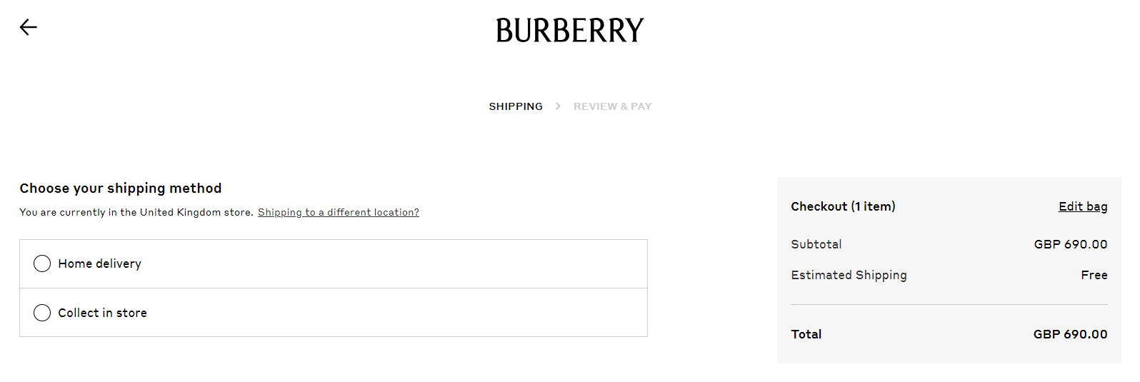
- At checkout, provide reminder messaging that the store the user is on ships to X destination - giving them the opportunity to change this option before starting checkout. Again, adding a reminder that the bag will empty if they are redirected to another store is key. Burberry example below:
Payments
A customer’s issue with payment options, payment total not being shown, and payment page glitches, or a customer’s difficulty navigating the payment process.
- “Wanted to pay via Clearpay ,can see it on there but no option at then end when I came to make payment?"
- “You do not allow Klarna payment option for foreign purchasers. I've used Klarna for a couple of years now and prefer the option when making larger purchases. Please make this available to your US customers.”
Key takeaways and quick wins
- A simple but often missed touchpoint is displaying payment options based on currency and shipping region. Brands often shout about BNPL options on PDPs, but as these are dependent on region e.g. Klarna not available in the US, and ZipPay being more common in regions like Australia, being clear on what is accepted per region will help to prevent disappointment at checkout.
- Ensure products that are exempt from certain payment methods (e.g. orders under or over a certain value for Klarna or ClearPay) are also communicated on PDPs and Cart pages ahead of checkout.
- Ensure payment methods are hidden based on rules within checkout if they do not apply. This type of logic can now be achieved within Checkout Extensibility using specific apps such as HidePay.
Product availability
Most sites focus on optimising the conversion funnel, however an often neglected part of this is managing expectations and communications around sold out items. Census feedback shows that customers are frustrated with the lack of upfront transparency on item or size availability across their shopping journey.
A customer’s frustration when an item is out of stock
- “I would like it if you put a waiting list for sizes and styles that are out of stock”
- “Removing out of stock items from search results and providing clearer notifications when items are back in stock.”
Key takeaways and quick wins
Communicating product availability clearly across key touch points is an essential part of ensuring a frictionless user experience, even if items are out of stock. Some quick wins include:
- Remove out of stock items from search results or tag these items with something like ‘notify me’ or ‘sold out’.
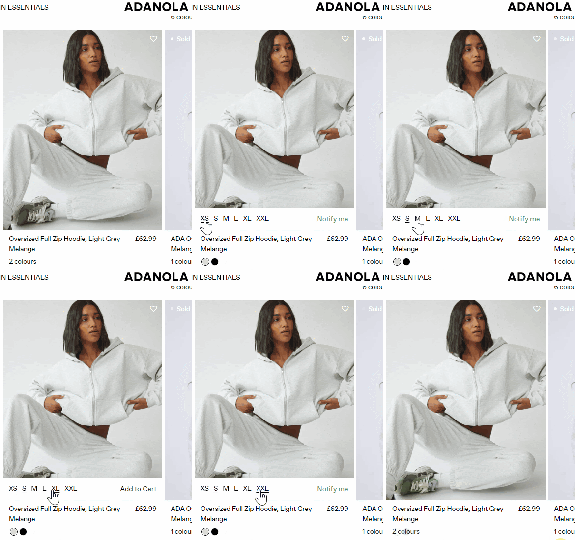
- Showing customers which sizes are available and in stock when hovering over product cards on PLPs (desktop) e.g. Adanola below.
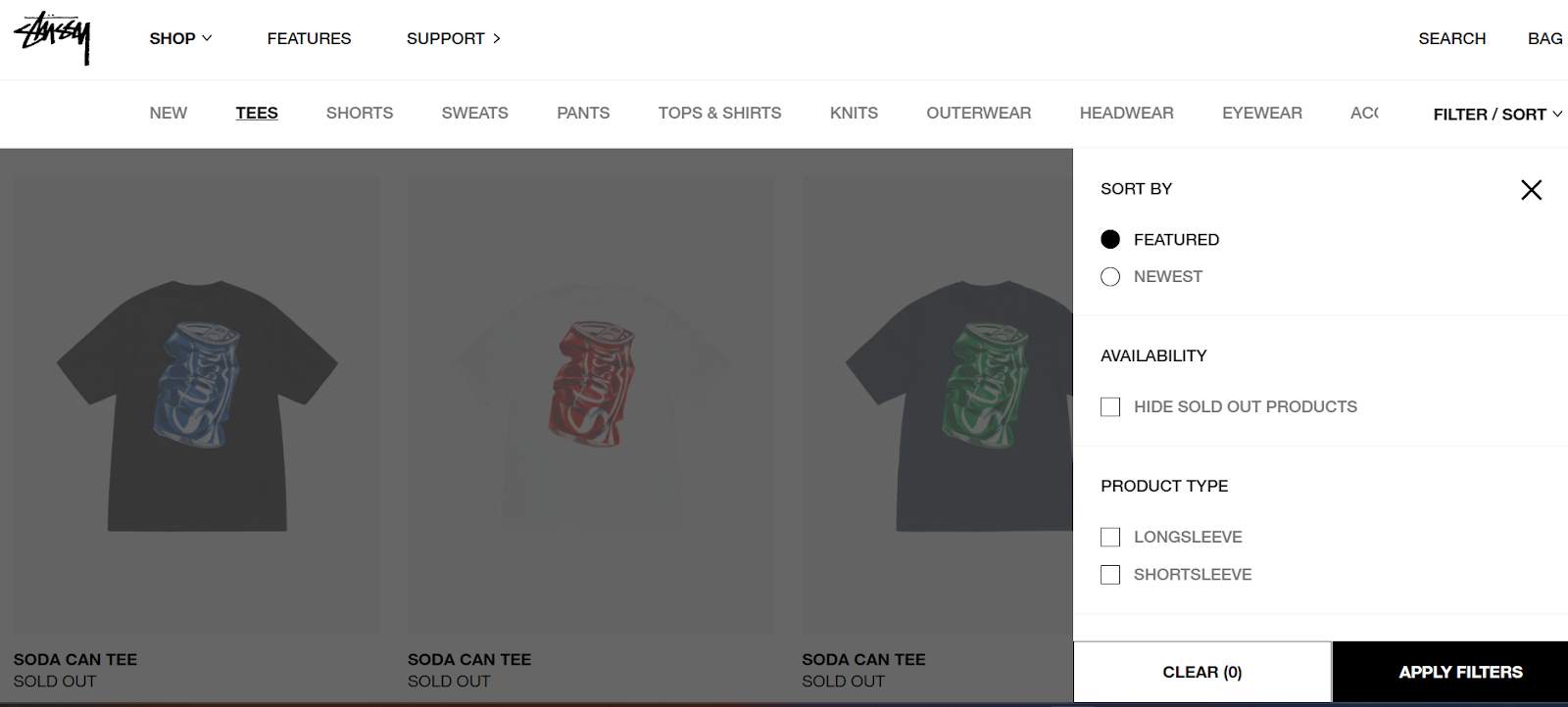
- Add an ‘out of stock’ filter to collection pages, such as in the Stussy example below.
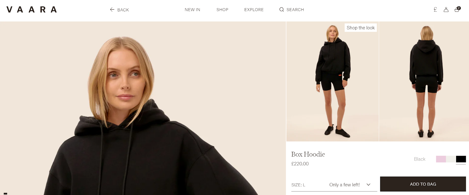
- Communicate when there are few items left in a size on PDPs as per the Vaara example below.
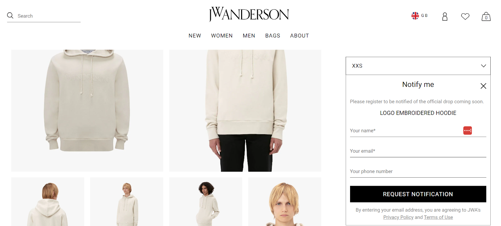
- Implementing a back in stock notification feature through an app like Backinstock.org or via your ESP e.g. Klaviyo. Some brands that have implemented it well include: The Frankie Shop and JW Anderson. If sending out automated email notifications from your back-in-stock (BIS) app, be sure to emphasise that stock is limited and may sell out again within these email flows. Based on how the mechanism of your chosen BIS app works, users will need to sign-up again if the item sells out once more, so be transparent and upfront about this.
Gift cards & gifting
A key insight from Census feedback over the last 12 months is that a large number of customers look to purchase gifts for others, however there are surprisingly few sites that really hone in on providing a smooth gifting experience for this customer. Common complaints are:
A customer not being able to purchase and send gift cards as expected.
- “So unclear how to send a gift card to a recipient, and not receive the gift card myself as the payer”
A customer’s frustration with the lack of gift wrapping options and flexibility around gifting.
- “Would have been easier to have an option to add a different delivery address when item is a gift”.
- “The option to make the delivery a gift with a message would be a great addition - I would have preferred my sister not know the cost of her present.”
Key takeaways and quick wins
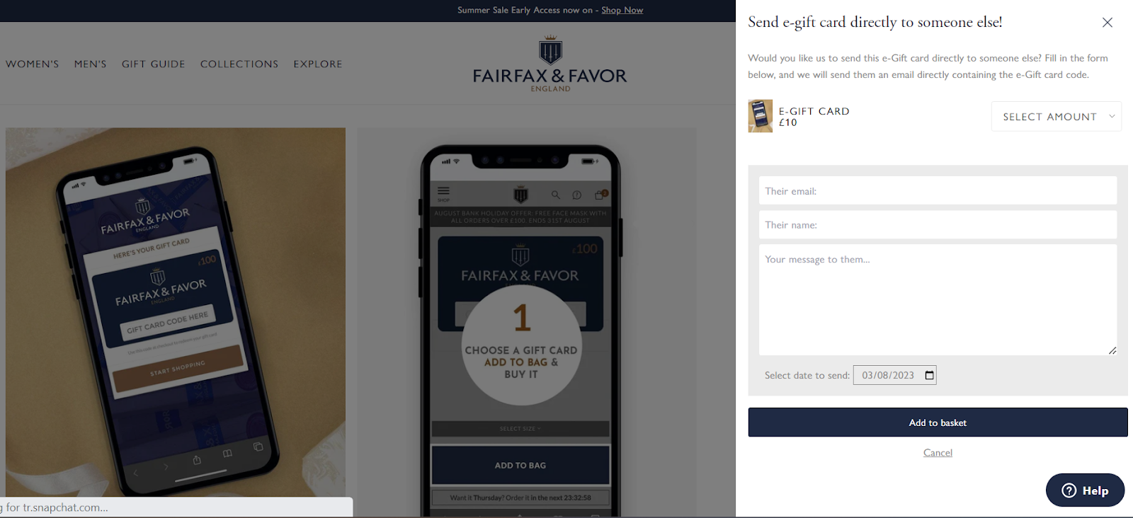
- Historically, Shopify merchants have needed to use a 3rd party app like Raise.ai or Govalo to enable functionality like sending e-gift cards to the recipient directly. Shopify has recently launched the ability to handle this natively within the platform and to also include a personal message for the recipient. Gift card scheduling can also be applied through the API. FairFax & Favour is a good example of a brand who has adopted this recently.
- Shopify native gift messaging has always been available for merchants to enable within the cart, however with many brands opting to skip the ‘cart’ step and link users directly to the checkout from the mini-bag, this step can often get missed by the user. With Shopify Extensibility, merchants now have the option to add a gift message or gift wrap directly within the checkout using the Checkout Blocks app with custom fields.
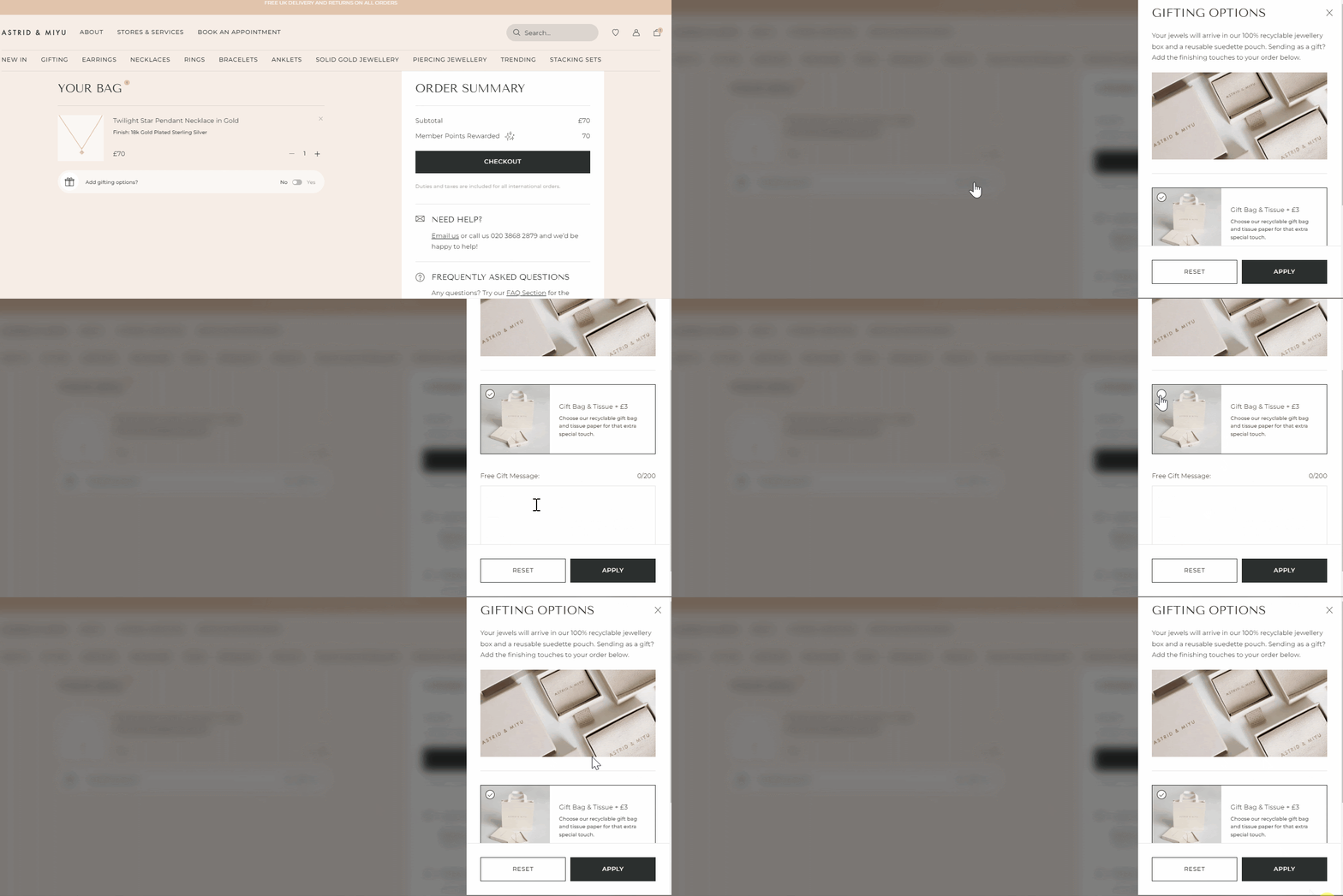
- For brands that rely heavily on gifting, building a well executed gift messaging section within the cart like our client Astrid & Miyu is recommended. Astrid & Miyu’s gifting proposition is simple, easy to find and slots nicely into the user’s journey to purchase.
Sizing information
This is an area we discuss a lot with our clients as part of site redesign projects or priority optimisations within a roadmap, and whilst the execution of this can vary wildly across verticals, the principles of providing customers with as much information as possible in a succinct and digestible way remains the same. We found the most common complaints included:
A brand’s unclear sizing information and lack of detailed measurements
- Non-specific product size guides.
- Lack of clarity around what size the model is wearing for a comparative understanding.
- Limited information on product pages and customers needing to ‘hunt’ for the information they need.
Key takeaways and quick wins
- A simple win, but one that is often overlooked is to include product category specific size charts on PDPs. There should then be one master ‘Size guide’ page with all size charts available and linked within the FAQs section, footer and Help Centre of your online store. PANGAIA is a good example of this.
- If your brand positioning permits, consider adding reviews to your PDPs with filters for specific attributes (e.g. sizing, fit, quality) to help customers find real-life opinions from others they can relate to, such as with a similar body type. This can act as a vital trust signal and supplements your size guides without spending a fortune on sizing tech. This requires a strategy for acquiring specific sizing data from customers and can be requested within your automated review emails. A good example of a brand doing this well is Everlane. This also works well for beauty brands where reviews highlight how the product can be used for specific skin types or skin concerns e.g. Ilia Beauty.
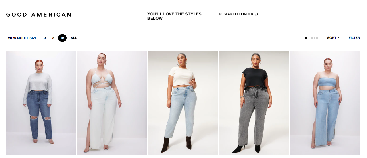
- If budget allows, using a fit finder tool could be the right solution to supporting customers to make educated choices about product sizing. Nudie Jean’s Fit finder and Good American’s ‘model selector’ on PLPs are two examples that have been executed well.
- Requesting detailed fit commentary through your digital returns platform can help you to better service customers who have had an issue with product fit. This can also be used as a data gathering tool for obtaining information to be repurposed within the product detail section of PDPs (such as when a size runs large or small).
Final thoughts
The data extracted from Census clearly highlights that whilst the focus of many DTC brands, developers and UX designers is often to improve customer shopping experiences with new features and tech, it is paramount to not neglect the basics, which ultimately form the foundations of being able to provide exceptional customer experiences in the long term.
We’d strongly advise building a strategy around obtaining qualitative customer feedback on your online store, capturing data either on-site during the purchase experience or post-purchase using an app like Census.
This is essential for building your sites NPS (net promoter score), as well as gaining valuable insights to inform on-site optimisations and ongoing roadmap. Many clients have also found this useful for pre and post site rebuild research.
Census has recently launched a feature powered by AI that actively suggests recommendations based on the customer feedback your store receives each month.
For brands that want to start utilising customer feedback, or those that feel overwhelmed about deciphering it, this can provide a good first port of call to start making impactful and actionable changes tailored to your individual store.
Subscribe to our newsletter
Our monthly newsletter is designed to be the most actionable and inspiring eCommerce newsletter in existence, combining examples of eCommerce innovation, benchmarking insights from the industry, and the latest news and eCommerce trends.
By signing up you are agreeing to our privacy policy.